Thursday, 19 December 2013
Video Effects
When creating and editing my music video, I needed to figure out how to put a blur around the edges of my video. I asked the technician at my college, and for hours we messed around with effects and certain programmes attempting of how to do it, but nothing seemed to work. After getting very frustrated and angry at the editing suits, I finally googled the problem, and after watching a few videos which were all conveniently all the wrong version of adobe pro, and many were instructing to use Photoshop to overlay a circle to get my desired effect, all did not work. I finally using a last resort youtubed my problem and found this video.
Step 1: Select video, and duplicate the video onto two tracks.
Step 2: Select video on Video 1, and New > Title.
Step 3: Created desired outline
Step 4: Select clip on Video 2 > Video Effects > Keying > Track Matte Key > Effect controls > Matte > Video 3
Step 5: Select Video 1 > Video Effects > Blur & Sharpen > Gaussian Blur - Select Blurriness
Step 6: Select Title > Video Effects > Blur & Sharpen > Gaussian Blur - Select Blurriness
Tuesday, 17 December 2013
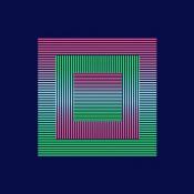
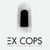
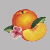
Best Indie Pop Albums of 2013
Taken from:
http://www.albumoftheyear.org/genre/4-indie-pop/2013/
Looking at album artwork that is already out there helps to create idea's of my own and allow me to see what is typical of indie-pop artwork, to try and relate this back to my own work and create a realistic looking artwork piece that people will be able to look at and now why and how it relates to my album name or artist name.
1. MONEY - The Shadow of Heaven
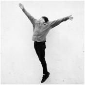
Released: August 26th, 2013
- This album art work is very plain, however effective. It is in black and white which gives it a vintage feel which seems to be very popular within the indie genre. The image is of a male character jumping in the air with arms spread wide, showing he is free and feeling infinite.
2. Los Campesinos! - No Blues
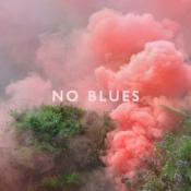
Released: October 29th, 2013
- This album artwork with the smoke seems to be conventional at the moment, it seems that smoke seems to be appearing in a lot of music videos recently and it is appearing more and more. This is next to impossible for a media student to create unless I were to find a smoke video on the internet and manipulate them together and colour them over a picture that corresponds to my music video.
3. Youth Lagoon - Wondrous Bughouse
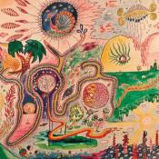
Released: March 5th, 2013
- This type of album artwork is common, but normally difficult to do. It is easier when you are working with an entire album as you have more lyrics to play with so you can create a piece which resembles the entire songs, not just one single song. This type of album artwork I could love to try, but it would take a lot of planning and figuring out what to try.
4. Tegan and Sara - Heartthrob
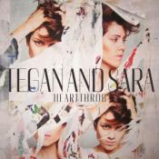
Released: January 29th, 2013
- This album artwork would be great for my single artwork. At the end I am planning on having a montage of photos of the artist with the love of the music video. I could then use these photos and create a collage of photos of them both together being loved up showing the lover between them and having it look like a montage of them together like this one shown.
5. Everything Everything - Arc
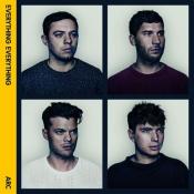
Released: January 14th, 2013
- Again like the one above, I could take this idea and create a montage of images of my artist and lover.
6. Daughter - If You Leave
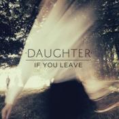
Released: March 18th, 2013
- This album artwork is very simple to do. It seems like a photo has been shot from the music video, and has an artistic spin on it; the artist is shown in the back of the picture and there seems to be a shadow/veil over the image which looks like the sun is shining, but almost looks like hair in places. This artwork confuses me, but looks good..
7. Foxygen - We Are the 21st Century Ambassadors of Peace & Magic
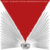
Released: January 22nd, 2013
- This album artwork is very simple, I do not understand what the image is trying to make the audience understand, and it may be a case of the only people that would truly understand this artwork would be the listeners of the band. I on the other hand would like to have any audience which see's my art work be able to understand and relate to it.
8. Big Deal - June Gloom
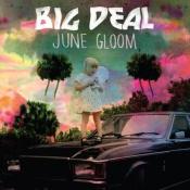
Released: June 3rd, 2013
- This album artwork is again something that has no significance to the songs, the only thing I can try to understand would be the pinks and oranges in the sky which could resemble June's sunsets. Other than that it may be only the listeners that will understand.
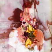
- This album artwork is very creative, the flowers on the picture are looking almost as if they are the actors beard. The background behind the talent is almost as if its liquid and moving.
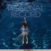
- This album artwork is quite plain, it does not seem to match the album title, but without listening to the album i cannot make this judgement.
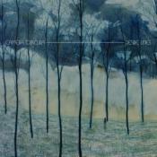
- This album artwork in my eyes is quite clever, the title is 'Desire Lines' and the tree's are all roughly straight lines. So through the play on the words, this album artwork is simple but effect for what the artist would want out of it.
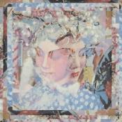
- This album art work looks quite plain at first, but as you look deeper into it, it is made up of many levels of photographs and aspects working together to make quite a beautiful image.
- This album art work is very simple, and i do not believe that it links to the album in any way, so I will not be considering this idea.
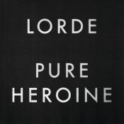
- This album artwork is very very simple. But the 'Pure' could be reffering to the fact that the album artwork is very simple.
- This album artwork is very simple, maybe I would have to listen to the album to attempt to understand the image, but just by looking at it, it has the artists name, the album name and also an image that possibly relates.
- This album artwork is very simple, it seems to have no relevance to the album name at all. For an album to be effective in my eyes it must have some relevance to the album name or even the artists name.
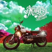
- This album artwork is quite artsy. The colours are not relatable to the real world, so there can be no connection between real world and this artwork apart from the motorcycle.
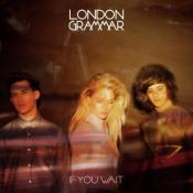
- This album artwork is just a photo taken of the band, with their album name and group name. this artwork is effective, as when an audience buys the album they know who the music is created by, and has the relevant details needed for it to be known as soon as someone sets eyes upon it.
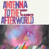
- This album artwork is relevant to the album name, as the image is of a rooftop, looking upwards towards the skies as if looking to the after world were people normally relate heaven to be.

- This album artwork is quite simple, But seems to have no relevance to the album name or artists name, which is something I am currently trying to avoid.
Hypodermic Needle Theory
In class today, we had to present a powerpoint on the theory Hypodermic Needle Theory. We had to find examples of our own and explain this theory to the class and how we could use it for our coursework.
The reason why I should heavily consider this theory is because it suggests that the creator in charge 'injects' the ideas that they would like the audience to convey. The audience is passive, and are directly affected by what they view but the creator must think carefully to make sure that the audience is subjected to only one view of ideas so they cannot think anything else, or argue back with the ideas given to them.
The idea the creator injects them with must be clear and laid out well or the audience may not understand.
Friday, 13 December 2013


Monday, 9 December 2013
Album Artwork research

The only creative ones that are on here are Neon Tree's: Habits, Foster The People: Torches, and Tokyo Police Club: Champ. These are the only ones that stand out for me, as they are different, and are not like the rest due to being drawings, or lots of instruments and various props.
Imagine Dragons, Bastille, The Fray, Vampire Weekend, and the Kooks all have the fact that they are vintage images which makes them all similar. This may be conventional of the genre 'Indie-pop': and I will heavily consider this while thinking about designs for my artwork.
Subsidiary Product 1
For my first subsidiary product, I have chosen to do a
cover for its release as part of a digipak
(CD/DVD package).
Saturday, 7 December 2013
Filming - 6th December
This again, is for the same section of filming but again with that single light in the top corner, it creates a purple wave over my film. Also Jack stumbles at the top of the stairs which makes Amelia have to wait for him in order to descend down the stairs together. This stands out on the video so in all fairness I will need to re-film this section.
I then shot it from a different angle as heads were beginning to be chopped off, and the props and lighting downstairs were becoming an issue. So I then shot this, however forgetting about my equipment at the bottom of the stairs, when watching this video back I realised I had left my second tripod downstairs. So this clip cannot be used.
Thursday, 5 December 2013
Health and Safety Measures

First set of filming: 6th October
I have planned with my lead female, that I will be shooting a section of my music video at her house tomorrow. I will shoot scenes 7-13, in various angles to see which I prefer. I will be filming after college, and I will book out a camera with tripod and a memory card.
Monday, 2 December 2013
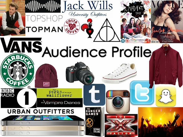
Audience Profile
An Audience profile helps me to understand my readers in trying to gather all of their passions into my music video. I can incorperate all of these thoughts into my production.
For example, Tv programmes could be on in the background of my shoot, so when my talent is walking past the tv, or watching the tv. These programmes or films could be displayed on the screen.
Props such as books, films, coffee, phones could be displayed on counter tops, and bedside tables.
This would make my music video seem more relevant to the given genre of Indie-Pop.

Subscribe to:
Posts (Atom)